This is a guest post from Pete Caputa, CEO @ Databox. Pete is a long-time friend to ZenPilot and the whole inbound agency community. He has worked with thousands of agencies over the years. This guy knows what he is talking about. To see Databox in action, check out their feature on Agency Toolbox. Enjoy! – Andrew @ ZenPilot
When I started offering marketing services to small businesses in the early 2000s, reporting results to clients was pretty simple. I’d just ask them, “Did our work get you any sales leads?” and if they said “yes,” I’d go do more work for them.
When I began the HubSpot partner program in 2008, I realized most agencies weren’t that much more sophisticated. They’d send a search engine optimization (SEO) keyword report or a few stats from Google Analytics over to each client each month.
Boy, have things changed since then.
Now, agencies and clients are swimming in marketing performance data, and monthly reports have become 30+ Powerpoint slides long.
Agencies are spending hours and hours pulling reports together for clients, often just to convince them things are working.
Most agencies tell us they use a process like this:
- Log into each digital marketing service (HubSpot, Google Analytics, Facebook Ads, etc.) and copy a few of the most important client KPIs into a spreadsheet.
- Assemble a Powerpoint with the graphs from the spreadsheet and some that are screen-grabbed directly from source apps.
- Type up some analysis and next-steps
If you’re more of a visual person, it looks like this:
We’ve found that inbound agencies average two to ten hours per client per month doing this. The agencies who have expanded their services to include sales enablement are spending even more.
By the time many agencies “get back to work,” it’s week two, and they’ve lost hours of productivity.
Besides wasting time, there are four other significant issues with this process.
- In most agencies, less time is spent analyzing and planning while more time is spent cutting and pasting.
- With insights and recommendations trapped in multiple documents, it’s tough to optimize campaigns and content more than once per month, if not per quarter.
- It’s not just about reporting anymore. Monitoring performance internally at your agency and doing analysis more frequently is critical for agencies that are agile and ROI-focused. These things are hard to do if you’re always logging into multiple tools.
- Changing the account manager on an account is more of a pain. Looking through months of Powerpoint documents to understand the account history is less than ideal.
Automated Reporting is the Path to Time Savings, Improved Reporting Processes, and Better Insights
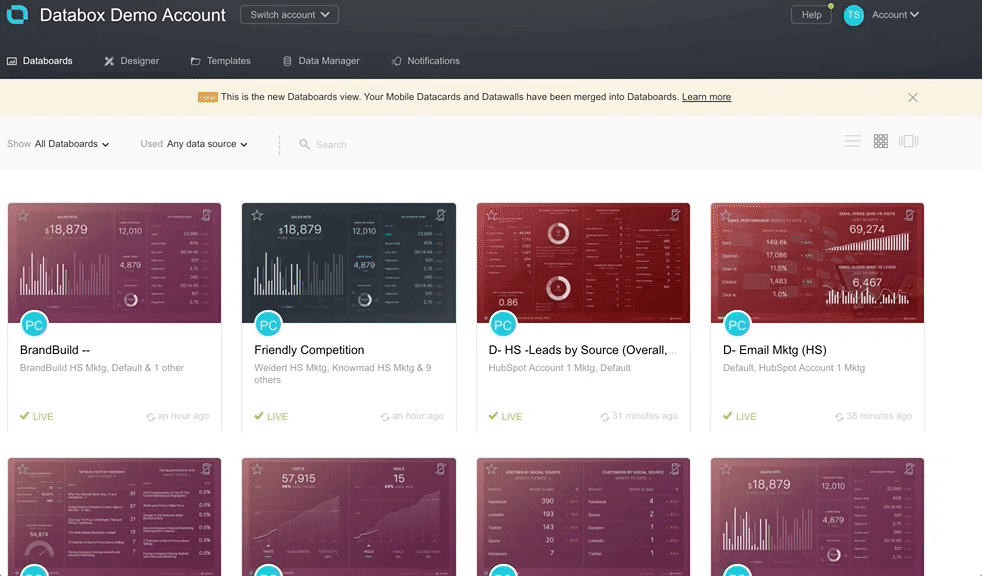
At Databox, we are now helping over 100 marketing agencies automate their client reporting. Agencies spend more time analyzing and optimizing and less time copy/pasting and formatting presentations.
Unlike other dashboarding and business intelligence solutions in the market, we are focused on helping HubSpot partners. While our closest competitor only pulls 11 metrics, we pull more than 145+ HubSpot analytics metrics and counting.
And as we’ve helped agency after agency choose a reporting software and then get setup on ours when they choose us, we have identified 20 steps that every agency can use to create their own automated reporting process.
These steps can be grouped into four major areas:
- Identifying which KPIs To Track and Where to Get That Data
- Choosing Which Reporting Software to Use
- Setting Up Automated Reports for Clients and Internal Monitoring
- The Process for Sharing and Collaborating With Clients in Real-Time
Implement this plan if you want to monitor all your marketing data in real-time in beautiful, consistent-looking dashboards, so that you never have to manually create a client marketing report ever again.
Part 1- Think Through Which Data Sources and KPIs You’ll Want to Monitor and Report
1- Make a List of Your Clients’ Most Important Marketing Data Sources
You may have a variety of marketing tech stacks across your clients, with different tools for certain clients or for executing certain tactics.
As a first step, outline the tools that are most important across all clients.
We’ve found that most HubSpot partners use Google Analytics, HubSpot Marketing, HubSpot CRM, Facebook Ads and Google AdWords with a majority of their clients.
For SEO, most HubSpot partners seem to use SEMRush, Moz and/or Google Search Console. Some inbound agencies produce a lot of videos, so Wistia, Youtube and Vimeo are important data sources for them. Some agencies specialize in doing inbound marketing for e-commerce clients and need a connection to Shopify.
Almost everyone has a client or two who cares about their top of the funnel social media metrics across Twitter, Facebook, Linkedin and Instagram.
Chances are, all your clients aren’t on HubSpot either. Many HubSpot partners also have a few clients on Mailchimp or Campaign Monitor, for example.
Like the schematic below shows, make a list of clients and the data sources you’ll need to pull for each of them.
A word of caution: when you take on this project, don’t limit yourself to just what you’d want to present to clients in a standard report. Your KPI reporting tool should give you a holistic picture of your client’s marketing activities and therefore needs to integrate deeply with your most important tools.
If you’ve expanded into sales enablement or other down-funnel services like many HubSpot partners have, you may want to monitor sales and services data too.
If you’re trying to show impact on revenue and can’t implement closed-loop marketing in HubSpot for some reason, showing data from your client’s CRM or financial systems might be valuable too. So, take all that into account and look for a tool that connects with a number of data sources or makes it possible for you or a developer to push data into the system via API.
2- List out All the Metrics You’ll Need to Monitor and Report
After you decide which tools are critical, make a list of the metrics you’ll need to monitor from each.
If you’re using HubSpot with most of your clients, this process becomes pretty easy. Here’s a list of 145+ metrics we automatically pull from HubSpot’s Analytics.
But if you have legacy clients not on HubSpot, use different marketing automation tools for some clients or offer more in-depth top of the funnel marketing services using other tools, you don’t get a free pass on this part of the exercise.
When making a list of metrics you need to monitor, make sure you understand the correlation between the services you’re offering and the outcome desired.
For example, let’s say your client decided to increase their pay-per-click budget and you also convinced them to invest heavily in content marketing. Chances are, the pay-per-click ads will produce qualified leads pretty quickly, if they aren’t already.
But, since they’re new to blogging and it may be some time before blogging starts generating sales qualified leads, you’ll need to think about how you’re going to keep them excited about it, in the meanwhile.
In this scenario, you might need to show which inbound marketing tactics are creating Marketing Qualified Leads (MQLs) and Sales Qualified Leads (SQLs)
Here are metrics you might want to display:
- Pageviews, time on site, goal conversions and return visitors for each blog post using Google Analytics data.
- Leads, MQLs and SQLs from organic, social and referral sources using data from HubSpot Marketing.
- Calls made by reps from the HubSpot CRM
Start with forming a hypothesis around all the metrics that support the client’s goals. Then, find or build a dashboard that helps you communicate what’s important.
3- Make Sure the Client Agrees with Your KPIs
This part of the process will help you demonstrate your commitment to helping your client achieve THEIR goals. So, if you have not recently had the conversation about which KPIs drive their business, now is the time.
If you’re selling inbound retainers, the ultimate goal is usually to generate revenue for clients. Once you know their revenue goals (or help them set reasonable ones), you can determine the numbers of SQLs, MQLs, Leads, visitors, traffic by source and so on that you will need to produce. Here’s an inbound marketing calculator and guide on how to use it and here’s some advice from Garth Pedersen, Marketing Analytics Manager at MPull, a HubSpot Platinum partner, on how to have the conversation about setting reasonable goals based on historical data, if you’re new to this process.
Don’t skip this conversation. This conversation will heavily inform what you monitor and report.
Part 2 – Choose Your Reporting Software
There are hundreds of tools on the market for reporting. (Here’s a list of nine from HubSpot.)
While Databox is the only business intelligence or dashboarding tool (whatever you want to call us is fine) that is a Premier HubSpot Connect Partner with more than 1300 HubSpot installs, I’m assuming you’re going to do your own evaluation.
Here’s how I’d recommend you evaluate different tools:
4- Figure out How You’ll Get Your Clients’ Data into Different Reporting Tools
Some companies, like Databox, put a lot of effort into building out-of-the-box integrations with other tools, while some don’t.
Some tools, including Databox, make it possible for you to push data in via API, while some don’t.
A few tools will give you access to search or pay-per-click (PPC) data as part of their service, while some, like Databox, require you to connect to other SEO and PPC ad tools in order to visualize search metrics.
To help you think through the challenge of selecting a tool that lets you pull in your data — and I’d say this is the biggest challenge to automated reporting – here are the four ways to get data into Databox. Starting with the easiest method first, here they are:
- Connect to your accounts via OAuth. Oauth simply lets you give us access to your data without sharing your password directly with us. For example, once you sign up for a Databox account, you’ll be prompted to login to your HubSpot Marketing account via our interface and we’ll automatically pull your HubSpot marketing data into Databox for you. You only have to complete this process once. We integrate with 50+ tools in this way. A few tools on the market require you to import your own data each month.
- Zapier. Using our Zapier integration, you can push data into Databox from all of the services they integrate with.
- Push data into a SQL database. If you have the ability to create and push your data into a SQL database, Databox makes it possible to connect and pull data from many of them: MySQL, PostgreSQL, Amazon AWS RedShift and Microsoft Azure SQL. Some agencies have invested in building out a SQL data warehouse. If that’s you, this is a great option since you can write SQL code right in Databox to pull and visualize different cuts of your data directly from your database.
- Push data in via our API. Using our API, you can push your custom data in. Large companies with lots of enterprise data sources use this, and a few enterprise-analytics agencies do this too. But, most HubSpot partners do not need to use our APIs to push in data, as they can rely on our OAuth integrations.
As mentioned, method #1 is by far the easiest. And while we do integrate with 50+ tools with this method, we certainly don’t cover all of the tools you might one day use. We are making progress, though. Each quarter, we build new integrations with other data sources.
We prioritize which connectors to build based on the number of requests we get and you can request one here. Given we have a large number of HubSpot’s largest partners using us, we’ve already built integrations with many of the tools that integrate with HubSpot, like Wistia, Drift, SeventhSense, VOIQ, Zendesk, Salesforce, HelpScout and Shopify.
In an attempt to build more connectors faster, we’ve also started to let third parties build out our official connectors for us and we will launch the first few of those soon.
Lastly, if you want to hire us or a partner to either build a connector or pull your data in for you, that can be done.
Some other tools make it possible for you to pull data from a spreadsheet or by uploading a csv. This is our number one integration request and something we’ll launch later in 2017.
If you’re a HubSpot partner, this might sound nice if you’re already cutting and pasting data into a spreadsheet, but it doesn’t help you eliminate hours of cutting and pasting. For HubSpot partners specifically, we’re pulling most data you need for you via OAuth, eliminating the need for spreadsheet integration for HubSpot reporting, at least.
5 – Make Sure You Can Pull Different Cuts of Your Client’s Data
After figuring out which systems and metrics you need to pull data from, you should have a good handle on all the metrics that will form a compelling story about your agency’s work.
But, remember, your client is likely not a data-driven marketing nerd like you! So, it is up to you to make the dashboards simple enough to quickly digest. When it comes time to report results, the sophistication of your clients will dictate how much data you report. You’ll overwhelm some clients if you report too much data. For example, Stream Creative only includes data that is relevant to non-marketing executives when reporting to their small business clients.
On the other end of the spectrum, some clients will need much more granular reporting across all their marketing and sales activities.
As reporting requests get more sophisticated, more customization may be needed. For example, we often see companies using different pipelines, custom fields and Smart Lists in HubSpot to track different things. When they do things this way, custom reports must be created.
So, look for a system that allows you to standardize your reports, but also customize them for each client too, when necessary.
A quick way to make sure of this: Look for tools with free versions or fully-featured free trials. You will quickly discover whether the tool lives up to the hype. If it doesn’t have a free version, the tool will probably require a developer or business analytics expert to operate.
Most reporting tools also provide support services and have a network of experienced users. Don’t be afraid to ask the software company or their existing partners how to do something specific.
6 – Make a List of Features You Want and Why
There are two big different types of tools on the market: reporting tools and business intelligence tools.
The latter are usually expensive and more suitable for large enterprises that need to pull in data from different systems, cross-tabulate data from different systems and identify correlations. They are best used by full-time analysts. They usually take a long time to deploy.
Most agencies just need a reporting tool that enables some basic analysis. The analysis most agencies need to do can be pulled from one data source, so cross-tabulating and data transformation are not necessary.
For example, there’s rarely a need to correlate Google Analytics data with HubSpot analytics data, but visualizing the data side-by-side can be helpful. Databox enables this level of analysis easily.
Here are a few additional questions to consider as you evaluate different tools:
- Does the tool automatically integrate with your key services? Or do you need to manually upload your data yourself? (Clearly, I can’t stress this one enough.)
- Does it offer built-in KPI report templates for the tools you use, so you can quickly get started on your own?
- How often does it update your data? Hourly or daily?
- Do you need the tool to spit out a monthly report or offer real-time reporting, or both?
- Can you brand the reports with your or your clients’ color and logos? Can you change the domain name where your reports will be hosted?
- Does the Company have a specific program dedicated to agencies with discounted pricing and/or commissions?
- Can you view data on multiple devices: mobile, TV on your office wall, computer?
- Can you easily create client accounts that stay connected to a master agency account?
- Can you add notes within the tool so all team members and clients can see your thoughts?
- Does it allow you to set up alerts so that you can get warnings when something is wrong?
- Can you enter goals you’ve set with clients so you can track progress to targets you’ve set?
7 – Consider the Cost of the Software
Some reporting tools will charge you more if you’re an agency or if you want to brand your reports as your own. Few of them offer a free version to help you get started.
Having worked with thousands of agencies for more than a decade now, I think that’s silly.
We’ve taken the opposite approach.
You can roll out reporting to clients with a Databox Agency Free account. Our free forever agency account allows you to build 3 dashboards per client for up to ten clients, pulling data from up to 3 data sources for each client.
We also provide a very heavy discount to agencies who decide to use us for their full reporting to all their clients. Our paid plans for agencies still only work out to between $10 to $25/month per client, enabling you to provide 10 to 50 dashboards and data sources per client, respectively. In other words, our agency pricing is 80-90% off our list pricing when you purchase 10 accounts at once.
8 – Ask if They Send You Business
Too many marketing software companies operate a 1-way street. They expect you to bring clients, but they put zero effort into sending you business. Or they make you sell a certain amount before you’re even eligible to be listed on their site.
At Databox, we’ve put co-marketing with agencies at the core of what we’re doing. And while you need to demonstrate your ability to use the tool, there’s no fee or reselling requirement to get involved.
To generate leads from Databox, you can submit a template to our report directory. Whenever any of our users downloads your template, you’ll get a notification with their contact information. We’re sending nearly a thousand leads per month out to our partners.
If you think you can meet our editorial guidelines, you can also suggest an unlimited number of guest posts to get in front of our 14,000 subscribers. Not ready for that type of effort? You can quickly contribute quotes to other articles we’re writing (or updating) and receive a link to your site or relevant content you’ve produced on the subject.
Some agencies generate more leads from our website than they do their own.
Here’s an example of how Yello Veedub has taken advantage of our programs.
- Our site visitors and users can visit their profile page to see all of the amazing Facebook ads templates they’ve produced.
- Users can also access these templates from our website and within our product; templates are accessible to all our users via the main navigation of our product and our site.
- Brendon Macdonald, owner of Yello Veedub, also wrote an amazing article for our blog called “Hard-Earned Facebook Ad ROI Secrets” which features his facebook ad templates.
By working with our early agency partners and our own efforts, our templates, content and co-marketing have helped us 3x our traffic in 7 months and growth shows no signs of slowing down.
So, our ability to send leads to partners is steadily growing. Trust us — we measure it closely. 🙂
9 – Determine How Much Effort It’ll Take to Get Up and Running
There are a wide range of reporting tools that range from really simple to really complex. As you might imagine, the ones that are complex are usually used by larger companies and have lots of bells and whistles. They also have a large learning curve and expensive implementation fees.
Databox is designed to be deployed quickly and on your own. Many companies try our software, figure out how to use it, and then buy it without even talking to us.
Try it yourself. Getting up and running will probably take you less time than reading the rest of this guide.
10 – Find out If They’ll Help You Learn How to Deliver New Services
With the proliferation of marketing technology, there’s no better time to be a marketer. The world is your oyster.
But, it’s also a full time job to learn what each piece of marketing software or service can offer. No individual or small agency can possibly keep up.
To try and help small agencies learn about the best tools, we do twice monthly training sessions for agencies to teach them how to leverage the tools we integrate with.
For example, every HubSpot customer should be using SeventhSense’s email send-time personalization to improve open and click rates. But, only a few smart ones were… until we got involved.
We’re trying to help agencies deliver better results through improved use of technology through our partnerships with other HubSpot Connect partners, like Seventh Sense.
If you’re going to partner with a marketing reporting company, ask them if they’ll help you learn about and roll out new services more easily.
Part 3- Setup Automated Dashboards
11 – Start with Proven Report Templates Created by Your Peers
To start, we strongly recommend creating standardized reports you’ll use with every client.
To make that easy for you, start with reports from our report dashboard directory. You can grab them in seconds and with just a few clicks, you can visualize your data in them. Then, by tweaking them, you can create your own standardized reports within your own account using our Report designer.
If you’re a HubSpot partner, you most likely sell an inbound marketing retainer that includes a set of services to help your clients attract, convert, close and delight their own clients. So, you’ll want your reporting to provide supporting evidence that you’re helping them do just that.
HubSpot Diamond partner, Revenue River, has a dashboard for each step of the inbound methodology. As an example, here’s what their Convert dashboard looks like:
They, along with many other HubSpot agency partners have chosen to share their templates with our community of users.
Here are all of the Revenue River’s dashboards:
Revenue River has also published their Convert and Loyalty Dashboard, which they use for their e-commerce clients on the Shopify platform.
Don’t want to use the inbound methodology to structure your reporting? Want to report based on the work you’re doing instead? You can use dashboards with data from HubSpot for blogging, landing pages and email campaigns, if you’d rather present results based on the tactics you’re employing.
HubSpot partners have built dashboards for many other tools too. For example, many smaller HubSpot partners rely heavily on Google Analytics, since their legacy clients haven’t splurged for HubSpot yet.
Pepperland Marketing has built two dashboard that have been collectively downloaded nearly 300 times. Both dashboards leverage our integration with Google’s free products: Google Analytics KPI dashboard and Google Organic Search Console dashboard.
Here are other HubSpot partners who have shared their templates:
- Square 2 Marketing – HubSpot marketing, HubSpot CRM and social media dashboards
- Kuno Creative – HubSpot marketing, HubSpot CRM, SEMRush dashboards
- Nextiny Marketing – HubSpot CRM, HubSpot Marketing multiple account rollup dashboards
- SeventhSense – Email marketing dashboards using HubSpot, Google Analytics and SeventhSense.
- Denamico – HubSpot, Social dashboard including Twitter, Linkedin, Facebook.
- ESM Inbound – HubSpot Marketing, HubSpot CRM and Google Analytics dashboards
- Weidert Group – HubSpot marketing
- Yello Veedub – Facebook ads and Google analytics dashboards
- Stream Creative – SEMRush dashboards
- OverGo Studio – Google Analytics & Salesforce dashboards
- Digital Inbound – Google Analytics dashboards
Click any of the agency’s names in the list above to see their templates.
12- Design and Style Your Own Reports
When building your own dashboards (or tweaking existing templates to suit your needs), you’ll need to think through a few things:
- How to visualize specific types of data
- Which data you’ll want on each dashboard.
- How you’ll brand the reports with your look and feel
When it comes to visualizing metrics, some visualization types are better than others. Here’s a list of all our current visualization types. (More coming soon!)
Personal preference factors heavily into choosing different visualization types, but it also depends on why you’re looking at the data.
For example, our marketing manager, Kevin Kononenko, prefers bar graphs that show daily fluctuations, like the Datablock below that shows the number of daily site visitors this month vs last month.
He has monthly goals he needs to hit, but he likes to look at each day’s impact separately to ensure his daily activities are tracking towards his monthly goal. He also likes to see the impact of his work on a daily basis, like blogging, offer creation, social media promotion, email marketing and co-marketing.
As an aside, and as you might have guessed, this data is from March, since the previous month’s data stopped on the 28th. The daily granularity also helps Kevin see how the length of the month impacts monthly performance. If you didn’t remember that March was 3 days longer, you’d think you were doing really well.
While March is up 31%, the graph helps you see that there was three extra days in March (vs February) and that all other days were a bit better too. You wouldn’t see that if you used the cumulative line chart below.
Back to the point: While Kevin loves looking at the data daily, I love looking at cumulative line charts to see where we’re performing against our monthly goal and last month in aggregate.
As an example, the chart below shows blog post views month to date against last month. I’m not as involved in the daily activities, so I don’t need to see how every marketing activity impacts each day’s results.
All that said, both bar charts and line graphs are great for tracking really important numbers closely.
But, for some data, visualize it in table form instead. You can pack a lot more data in a table. For example, every HubSpot partner should be familiar with the data in the table below from the HubSpot’s Sources report. Notice how the second column shows % change month over month, just like Sources.
Once you decide how you want to visualize data, it’s time to decide which data to put together on one dashboard. Don’t feel like you have to reinvent the wheel here. Use the dashboards from the other agencies I’ve listed above. You can save a lot of time this way.
For example, here’s a dashboard that probably took HubSpot Diamond Partner, Square 2 Marketing, about an hour to put together initially, since it shows data from HubSpot, Twitter, Facebook, Linkedin and Instagram.
But, if you do want to get creative, think first about what you’re trying to communicate to your client or monitor yourself. To help you think through this process, let’s talk about an example with Facebook Ads.
Say you recently increased your client’s ad spend, but want to show how you increased lead volume and reduced their cost-per-click when you did.
You might want to use:
- A line chart that shows total spend overlaid on a bar chart with cost per click,
- A line chart measuring click-through rate with a comparison to the previous period,
- A calculation that measures cost per lead, combining Facebook Ads and HubSpot data.
There are no hard and fast rules about mixing up your visualization types, but you should try to tell a story with a combination of metrics in different visualizations.
You do not want to dump all your metrics onto the screen in one format as it won’t tell an effective story and it’ll be horrible to look at. Dashboards are meant to make the information easier to process, not more complicated.
Here are some guidelines:
- Time-oriented metrics are best represented with a line or bar chart.
- To show percentage of traffic from different channels, a pie chart is a good fit.
- If you want to show the ratio between two numbers, use a comparison block.
- If you want to show a list of things like blog posts, or landing pages and their relative performance, a table is best.
Creating these visualizations inside dashboards is easy using Databox’s Report Designer. Each Databoard (our word for dashboard) consists of Datablocks, where you control which data and time intervals are included. Here’s a few animated gifs that show you how to use the Designer.
Next up, brand the reports to your liking. You can add your logo, change the color scheme and add a background image. Here’s a great example from HubSpot Gold partner, Pepperland Marketing:
13 – Create a Standard Set of Reports You Can Re-Use with Each Client
Once you’ve either found templates that you’ll be using or built your own, it’s time to think through which clients will get which dashboards. As I show below, reports can be easily duplicated from your agency account into any and all of your client accounts with just one click.
But, before you go hog wild, think about coming up with different reporting packages that each include a stock set of reports.
To do this, agencies usually divide up their client list by the level of detail the clients will want. For example, some clients will just want high-level dashboards.
What’s important to them is to see how the entire marketing and sales funnel is working against the goals you’ve set. However, some clients, who may be a bit more involved in marketing strategy and execution with you, will want a more detailed set of reports.
Group your clients up like in the schematic below or in other ways that might make sense for your agency.
Other ways that agencies have grouped their clients:
- The services you’re offering: SEO versus lead generation vs marketing automation clients.
- The tools you’re using: HubSpot Marketing vs Active Campaign
- The size of your retainer
No matter how you group your clients, come up with a standard set of reports for each group.
14- Create Client Accounts
Now, you’re finally ready to create client accounts. See how to do it in the animated gif below.
You’ll then push your report templates from your account into your client’s account, like the animated gif below demonstrates.
15- Sequence Dashboards in a Carousel to Tell a Story with Your Data
Once you’ve populated your clients’ accounts with their dashboards, put them in a sequence that tells a story. The key to reporting results to clients is to tell a story that supports your recommended next steps. Putting your dashboards in a sequence helps with that.
When presenting them live, you’ll be able to pause the animated sequence. If you put them on a TV, you can let the animation run with preset pauses too. See the animated gif below as an example.
16- Roll out Reports Internally
You’re almost ready to start sharing reports with clients. But, don’t be too eager to send it out to clients just yet. If you have multiple account managers and service delivery people in your agency, your next step is to roll out monitoring internally.
You might instinctively think that each account manager should create their own reports. We recommend the opposite.
Even though all account managers should learn how to roll out reports to clients, appoint a centralized person or a small team for building them. We have found that electing a point person in the agency for reporting will expedite the process.
This point person can also ensure that reports are standardized and understandable, enabling agency-wide monitoring. As a reminder, each report should answer the following questions:
- Is performance up or down?
- Are our activities producing results?
- Are we achieving the goals we’ve set?
- Do we have any issues we need to address?
Before the client gets to see reports, you should have a system within your agency for reviewing the reports first. Ask yourselves the questions above as you go through each client’s data. By reviewing the reports together internally, you can make sure everyone understands the new tool and you can verify the reports are the right ones for the client at this time.
Immediately before IMPACT, a HubSpot Diamond partner, rolled out Databox to clients, they held a four hour internal workshop to review the dashboards. Each account manager reviewed the dashboards for their client, wrote down recommendations based on the data and practiced presenting them to the team to make sure everyone was comfortable with the rollout.
Alright, now you have all your data organized and visualized appropriately and reviewed by your team. Now, you need to decide how the client will experience it. Now that you can generate reports instantly, you have many options beyond the traditional monthly slide deck.
17- Tell Your Clients How Automated Reporting Will Help Them
First, the client needs to understand why you’re making a change.
Yes, eliminating hours of report preparation is great for your agency. But the client needs to understand why this is valuable for them.
Here are 4 value propositions you could present to your clients:
- More time to analyze their data: If you are not spending time on copying and pasting, you will be able to spend more time on providing insights. Stephen Barrone from FullFunnel explains it this way: “Instead of reporting numbers, we can dive right into conversations about improving the numbers.”
- Reports are easier to understand: When you use screenshots from different services or spreadsheets, clients struggle to quickly assess performance. When you use graphs with consistent formatting and time frames every month, use our built-in color-coding to show when performance is up or down, and display performance versus goal, they can quickly understand how good of a job you are doing or where improvement needs to happen.
- Real-time decision-making for your agency: If something goes wrong on the 17th of the month, you do NOT want to wait until the end of the month to learn about this issue. With the ability to quickly scan performance data and even setup real-time alerts for any metric that hits a threshold or changes a certain amount over a specific time period, you can sleep at night knowing that your reporting service will surface issues early.
- Transparency with the client: If you want to prove the ROI of your services, you need to be willing to share data. You want the client to see the before/after picture of when you started your engagement vs. present day. You can’t be afraid to show the downs either. They happen. The best agencies are willing to show when things aren’t going well because they know how they’ll fix it.
18- Create a Plan for Regularly Sharing and Discussing Results
You can share different types of data at different frequencies now that reports can be pulled instantly.
- Daily– Hopefully, your reporting tool has a native mobile app. You can create daily reports with notifications that include changes in the most important metrics. These should be pretty focused on just a few key metrics.
- Weekly– You can create an automated weekly email with a snapshot of their dashboard and a live URL in case they want to dig in. This requires zero effort on your part after you set up the email snapshot send. You can send this email out internally or directly to the client.
- Monthly- This is your typical monthly report. Most agencies do a monthly review call with their clients to review the month’s progress and talk about next month. A few Databox agencies record a video for their clients using Soapbox (from Wistia) or Viewedit (from Vidyard).
Real-time reporting doesn’t obviate the need to discuss results with clients. When having conversations with clients, structure your conversations like the following:
- Review performance including what activities and campaigns drove the performance.
- Explain any decisions you made to improve results during the month.
- Make recommendations for the following month based on client’s goals and where you think you can make improvements.
19- Set up Your Clients on Multiple Devices
Some clients will be very excited about their cool new dashboards, especially since they can be viewed on any device:
- TV screen– Use a Chromebit or other Wi-Fi enabled device to put up live data on screens around their office.
- Mobile– Set them up to view their dashboards in our mobile app, and configure automated alerts and scorecards so performance gets pushed to them on their mobile device, slack or by email as frequently as they desire.
- Desktop- Send dashboards at scheduled intervals (daily, weekly, monthly, quarterly) with a link to a streaming URL with live data, so they can check in any time. You can even set up this URL on a subdomain of yours or your client’s.
- Slack: If your client uses Slack, you can integrate Databox with Slack to send updates proactively and allow your client to query their data. Some agencies use Slack to communicate with clients every day. Having data sent to a client’s Slack channel is a perfect way to start the day’s work.
- Apple Watch. Yeah, a little overboard, but cool nonetheless, if your client is an Apple enthusiast.
Some clients may not want or need to monitor their data this closely. One of these methods might be adequate. But, if you work with technically savvy clients like e-commerce or SaaS companies, having their data in front of them all the time will be a huge plus.
Also, consider buying your client a TV and hanging it in their office. Then, putting their sales metrics up on the screen along with the marketing metrics you’re driving.
This is a good way to hold them accountable to following up with leads and opportunities effectively. It also sends the message that you’re serious about driving business for them. Given the low cost of flat-screen TVs these days, this is a pretty simple investment to justify.
20- Enter Your Client’s Goals in the Dashboard
Remember those annual client goals we talked about in part one above?
To make sure you hit them, create monthly, intermediate goals that you track on a monthly basis. Also, set goals that support the other goals. For example, if you set a goal to generate 100 leads per month, and you’re going to try and get those leads from content marketing, set a goal for leads from organic traffic too. Doing this allows you to run short experiments and see what will get you to your goal in the easiest and quickest fashion.
Goals overlaid directly on your reports make it clear you are dedicated to client success. For your team, Goals also provides an internal reminder of progress towards the client’s monthly goal. I love this screen that shows all the goals you’ve set for a client and how you’re performing against it.
Whatever you do, do not create one marketing plan and wait 6-12 months later to realize you came up short. If you want to retain or upsell your client, use these monthly goals to remind them of your contribution towards hitting their overall business goals. Tracking goals on your dashboards should create easy conversations at renewal time, as well as more frequent upsell opportunities.
21 – Type Your Insights and Recommendations onto Your Dashboards
It is our mission to eliminate the need for manual, document-based reporting. We hate Powerpoint, Keynote and Google Slides. If you’re being honest, you do too.
Now that you have all your important data in one spot, wouldn’t it be easier to type your insights and recommendations right on top of the data, instead of pulling the data into a document so you can type next to it?
That’s what we enable. There are currently two ways to do this inside Databox:
- Add a notes Datablock where you can place the block on a dashboard and use it to type notes about the whole dashboard. This is good for high level client instructions like, “Use this dashboard to follow your success on social media” and to show correlations between two different metrics like, “Notice how the increase in Facebook followers has driven more traffic to your site from Facebook.”
- Add an annotation that is associated with a metric at a given point in time. This is perfect for explaining spikes in data (good or bad) like, “This week’s email campaign had a higher than normal click rate because we implemented send-time personalization, driving a spike in traffic” and for making recommendations at different points in time like, “Based on the success of two blog posts on topic x this month, we recommend we write more on this topic and find places to promote these existing articles, instead of creating new articles on new topics.”
Here’s what a Notes Datablock looks like:
And to see how it fits into a Databoard, take a look at this HubSpot Marketing KPI dashboard from HubSpot Platinum partner, Weidert Group, here:
Here’s what an annotation looks like:
We’ll continue to develop our Insights feature within Databox to enable marketing agencies to communicate in real-time with each other and with clients, and to keep a historical record of actions, insights and recommendations.
22- Support Upsell with More Advanced Dashboards and Services
Once you’ve established basic reporting for clients, you can begin to use Databox to upsell your clients on more work or additional services.
The easy way to do this is to pick a new dashboard that you provide to your clients every month – a “dashboard of the month” club, if you will.
Once again, you can leverage our report template directory to do this. Here’s a few more advanced dashboards built on top of Google Analytics:
- Advanced blog analytics dashboard
- Google search console SEO dashboard
- Email traffic analysis dashboard
- Executive E-commerce KPI Dashboard
While you don’t need to understand how these were built, you may want to build some advanced reports yourself. To do that, you’ll need to learn our advanced query builder.
It allows you to pull in different slices of data from more advanced analytics tools, applications and ad systems like Google Analytics, HubSpot, Salesforce, Mixpanel, Adobe Analytics, Facebook ads, Google Adwords and a few more.
For example, if you wanted to see the number of sessions of people who visit your client’s site on a mobile device, you could run a query that looks at sessions by device type and segment it to show sessions on mobile, tablet and desktops.
23- Offer Reporting as a Service
As you develop your competence around advanced reporting, you’ll find it solves many communication challenges between you and your client. You’ll also discover it improves communication internally for your client.
Some of our partners are now being asked by clients to improve reporting in other areas or to do specific analysis of something.
Assuming you’ve bundled reporting into your retainers, clients are already paying for it. As you improve your ability to use data to drive marketing and sales decisions, many will ask you how you can do more. Obviously, that’s an opportunity to offer a service.
Many internal marketers struggle to communicate their impact to their peers and bosses. Whether they’re paying you for services or not, with Databox, you can help them solve their problem. Some agencies are even leading with Databox as a low-cost service, even using it in their sales process to point out areas of improvement to prospective clients.
How Real-time, Aggregated Client KPI Monitoring Changes the Impact of Your Work
When most agencies kick off a project to automate their reporting, they’re motivated by the time-savings and elimination of the copy/paste grunt-work.
But most HubSpot partners who roll out near-real-time, aggregated, any-device reporting, quickly realize many other benefits once monitoring and reporting performance becomes easier.
Real-time monitoring is the basis for improving your agency’s performance in a variety of ways:
- Maximizing client ROI,
- Transitioning to agile, data-driven decision making,
- Communicating the value you’re providing
- Holding clients accountable to doing their part.
- Upselling clients on additional work and additional services,
Are you next? Start by using our free agency reporting product or apply for our program.
Create an automated reporting system for free
Join the Databox Partner Program and never copy/paste into a spreadsheet again
Topics: Tools, Best Practices
Related Posts
How to Build a Sales System in the HubSpot CRM
HubSpot File Manager Best Practices and Optimization Tips
How to Sell HubSpot as an Inbound Agency
Have you read the Agency Freedom Manifesto?
It’s time to build an agency that serves you, not vice versa.
Read the manifesto and start your journey to freedom.